11 SaaS Landing Page Examples and Why They Work
Well-designed landing pages are a must for any SaaS business. Not every visitor will come to your site through the homepage – they might come via email campaigns, PPC advertising, or any of your other marketing efforts. A landing page lets you guide traffic in precisely the direction you wish. That keeps them engaged with your site, limits your bounce rate, and boosts your conversion rate. What, though, makes for a well-designed landing page?
There’s no cut and dried template for SaaS businesses to use. Different firms can and do explore different routes to find the right page design for them. To help you make your decision, we’ve picked out some of the best SaaS landing page examples on the web. Scroll down through these 11 excellent examples, and you’re sure to find plenty of inspiration.
Book a Consultation
Landing Pages – The Basics
Landing pages are used to persuade a visitor to take a specific action. That action depends on what your conversion goal is for the page. Some landing pages might:
- Add leads to your email list
- Encourage visitors to download an eBook or guide
- Gather sign ups to a webinar or free consultation
- Sell a particular SaaS product
The beauty of landing pages is that you can tailor them to any goal. There’s plenty of room to be creative with landing page design. To flex your creative muscle fully, you need to know what options are open to you.
The best way to learn how to build your perfect landing page is via research into what works. Looking at some existing SaaS landing page examples is sure to get you inspired, in just the same way as competitor research is vital to content marketing.
SaaS Landing Page Examples
The following eleven landing pages provide a snapshot of various effective designs. These pages are used by SaaS companies to generate conversions of one kind or another.
What makes each of these SaaS websites compelling differs from one to the next. We’re going to look at them in turn and explain why they work brilliantly to meet the site’s needs. We’ll explain the major elements of each page.
What we can’t do is provide Analytics data for any of the pages – they’re not ours, after all. By taking a microscope to the page’s features, though, it should be clear why aspects of them are worth imitating. Let’s get to it, then, and give you that all-important inspiration for your landing pages.
Shopify
The Shopify landing page for the company’s free trial is an excellent example to start with. The beauty of this page is the way that it manages to be both detail-oriented and straightforward.
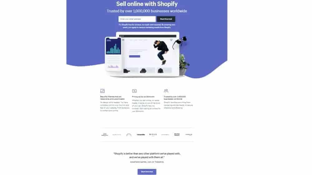
Toward the top of the page, there’s plenty of white space, an easy-to-read header, and no clutter. That gives the page a clean and attractive look. It also means there’s little getting in the way of a visitor who wants to ‘Get Started’ straight away.
The page does still manage to sell the trial to those visitors who are less convinced. It has three key points: easy-to-use themes, low pricing, and trustworthiness. These informative yet straightforward selling points of Shopify’s platform appear below the image. They explain why people should go ahead with the trial. They do so without turning the page into an unappealing factsheet.
Shopify’s subheading copy is also worth dwelling upon. The company is globally popular and they make sure to tell people as much. By citing the volume of businesses they already work with, they immediately build trust with new visitors to the page.
Muzzle
If your landing page’s aim is to sell your service, there are a few basic things it needs to impart to visitors. It must clearly show the value proposition, tell them what the product does, and explain why it might benefit them. Many pages use text or perhaps a video to do that. This landing page from Muzzle takes a different approach.
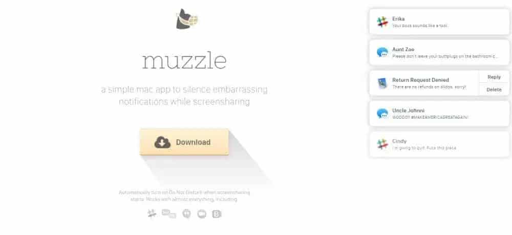
Muzzle is an app to silence notifications when you take screenshots or share your screen. The landing page instantly shows visitors when and why that’s a good thing to have. As soon as you hit the page, potentially embarrassing notifications appear.
The notifications fill the right of the screen, and you would not be keen to share any of them. The innovative page makes you laugh, and it sells the benefits of Muzzle’s product right off the bat. It also allows Muzzle to keep copy to a minimum and retain the clean, sharp look of the page. The simple copy they do use does a great job summarising their product in one sentence.
Wistia
The landing page Wistia use to get visitors to create a free account is like the Shopify page from earlier. Keeping things simple and using white space are the two most notable design choices the firm has made.
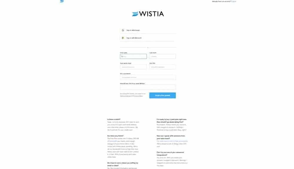
A form field and a button to ‘create a free account’ are all you see when you first hit the page. That makes it almost frictionless for pre-qualified leads to get started straight away.
Like Shopify, Wistia has then added more info ‘below the fold.’ By which we mean, it’s only visible once you scroll down. In this example, the extra content is in the form of a set of FAQs. They’re there to help overcome any objections visitors may have to sign up for a free account – in particular, highlighting how they don’t need your credit card details.
The page is an ideal combination of clean design and high-converting content. The ‘above the fold’ view is clean and simple. The copy featured below gets down to business answering any queries a more cautious lead may have.
Webflow
Webflow is a design tool for web developers. It stands to reason that their landing pages ought to be slick, stylish, and sure to convert. Fortunately for the company, that’s just what they are. The below landing page shows off Webflow’s product in impressive fashion.

There’s a comparatively small amount of text on the long(ish) page. Instead of laying out their platform’s features in lengthy prose, Webflow relies on clever copywriting and animations. Throughout the page, graphics and gifs show the tool in action.
That’s one major strength of this quirky yet straightforward page design. Another is the actual shape of the content in its top section. If you look at the text to the right of the page’s first image, it looks like a capital ‘F’. That’s not by accident. Research has proven that people scan content in an F-shaped pattern. By steering into that, Webflow are ensuring visitors to their page take in the information they want them to.
Much of the text they do use is in the form of testimonials and success stories – this acts as social proof, encouraging visitors to trust the brand.
That has a dual benefit. It makes the page more attractive and much easier to grasp the tool’s main elements. This page’s CTA buttons are also a notable feature. They all feature the same text; ‘Get started – it’s free.’ This removes a major pain point for potential customers.
Industrial Strength Marketing
This landing page from Industrial Strength Marketing starts strong. Its headline text is punchy, intriguing, and relatable for visitors. It immediately gets to the crux of the issue that the company’s product exists to address. That product helps businesses build mobile-friendly websites. The kind of high-quality websites that work on all devices, without site visitors having to zoom.
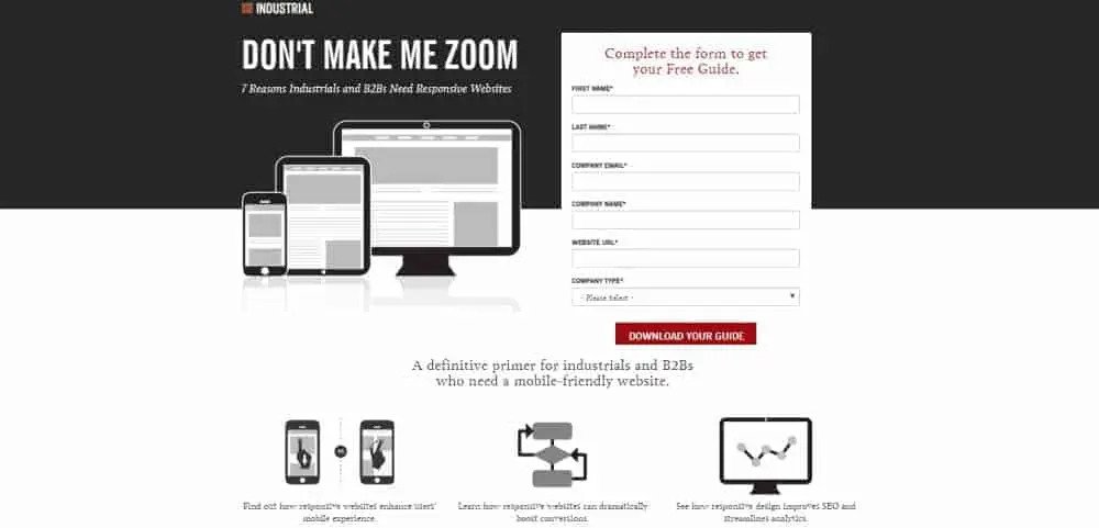
The overall design of this page is also compelling. The use of a black background serves to make the contact form appear more appealing. Intelligent application of red at the head of the form and for the button works well. It shows off the simplicity of the sign-up process. All of that attracts a visitor to complete the site’s desired conversion. In this case, that conversion is the download of a guide.
Inbound Emotion
It may seem odd to include a foreign-language page among our SaaS Landing page examples. The dynamic design of this page from Inbound Emotion, though, is well worth highlighting. It’s so good that even if you don’t speak Spanish, it’s easy to appreciate the page’s appeal. “eBook gratis,” too, is pretty self-explanatory even to the most lingually challenged.
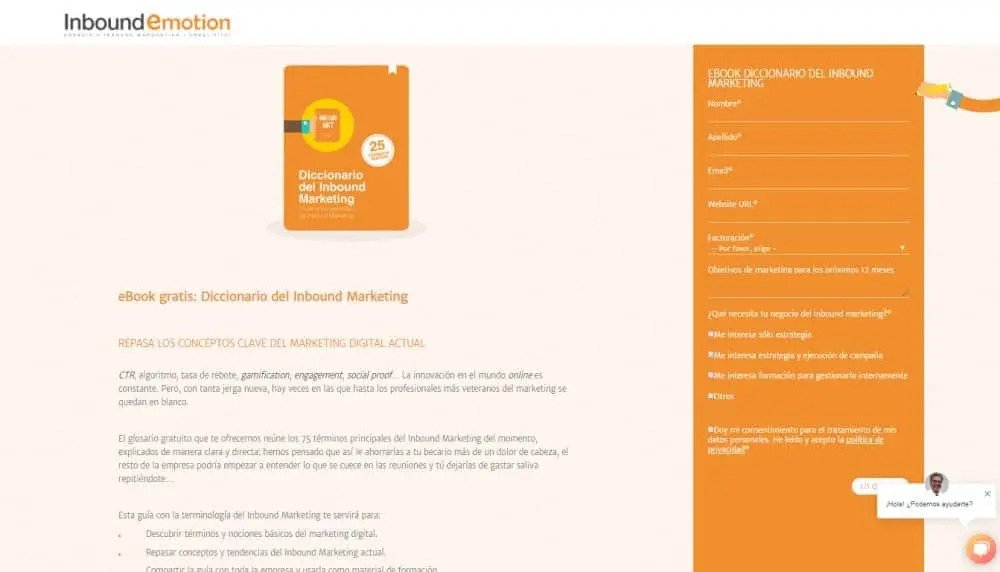
The most innovative part of this page’s design is its contact form. That simple form features at the right-hand side and stays bolted in place as you scroll. That means it’s always there, reminding you how easy it is to sign up for your free eBook.
The form, too, includes an eye-catching hand design, which points you toward the signup form. A matching hand also points to the page’s social media options, and similar images appear within the firm’s eBook. That kind of consistent branding is excellent for building trust with leads.
Velaro
Velaro offers “out of the box” live chat and customer engagement software solutions. eBooks, guides, and other free downloads are a big part of their marketing strategy. Each different download they offer has a landing page like the one below.
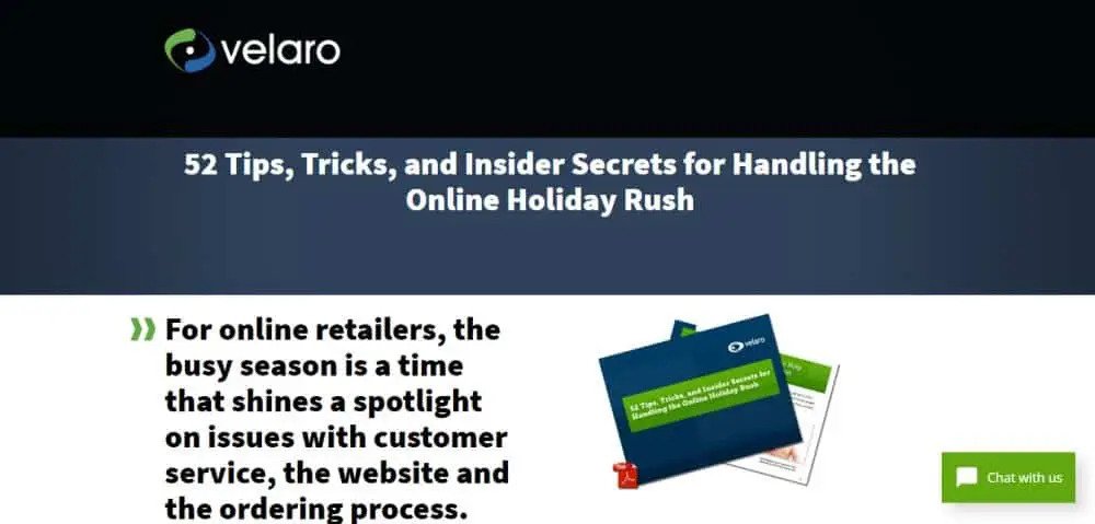
One of the great things about those landing pages is their consistent messaging and format. Each one looks and sounds similar, aiding consistent branding across the firm’s site. The design that the pages do follow also includes a couple of small but impressive features.
Green double chevron designs feature prominently on the pages. They always point to the most pertinent copy on the page. They also appear next to CTAs, to subconsciously suggest how important they are.
When it comes to the copy itself, it works to tease the content of the eBooks and guides themselves. That helps to build excitement with visitors to download the content and find out more. The most important copy sections, too, are always at the top and/or left of each page. That, once again, takes account of the F-shaped pattern of reading we’ve mentioned a few times before.
Other small design flourishes help make each page more user-friendly. The inclusion of the PDF icon at the corner of images of different downloads is a prime example. That shows users how they’ll get those downloads.
Unbounce
Unbounce specialise in helping clients build landing pages. Taking a look at the pages that they use can give you some excellent inspiration. Below is the top section of an Unbounce landing page for one of their online informational courses:
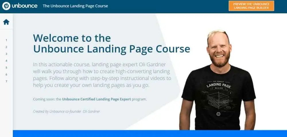
There are a couple of essential things to note about the page. First, is the prominent picture of the firm’s co-founder, who also wrote the course the page promotes. That photo puts a human face to the company. Marketers use this tactic to build trust and rapport with the site’s users – and it works! That makes those users more likely to progress with the course.
The amount of content packed onto the page is the other notable feature. Links to industry-specific stats, as well as menus to navigate through the course, are all included. FAQs also appear toward the bottom of the page, and yet the overall design is never compromised.
Landbot
Landbot is another firm that puts its product front and centre on their landing pages. Landbot creates chatbot-style landing pages, and their digital marketing team has cleverly made it so that’s what you’ll see when you first hit their site.

The landing page looks every inch like an IM chat. It talks to you like a friend would, and even sends emojis and gifs along the way. You’re immediately engaged by being asked to choose reply options to keep the chat going.
You then fill in your contact details as part of the chat, rather than in a separate form. It’s an ingenious way to ask site visitors for their information. They’ll give it, without feeling like it’s a chore or an imposition.
Bills.com
The last of our SaaS landing page examples is the debt relief company, Bills.com. They don’t feature their main form fields on the initial page you see when visiting their site. Instead, they present a question pertinent to every member of their target audience:
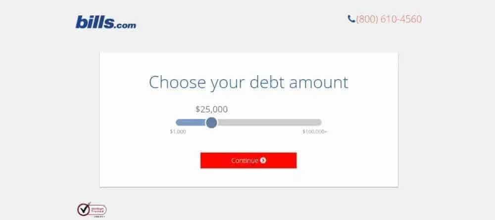
As soon as you hit the Bills.com landing page, you’re invited to interact with the web form. This multi-stage form assesses your eligibility for the service. It’s clever in the sense that the action required by the user is clear.
Landing Pages Aren’t One-Size-Fits-All
Browsing our SaaS landing page examples should have shown you one thing: above all else, pages don’t have to follow one prescribed template to be successful. The examples we’ve highlighted above could hardly be more different. Some prize simplicity and directness, others leverage innovation and humor. They all have their styles and tones.
What all the examples have in common is that they’re engaging and fit their target audiences. Hopefully, whether you’re a small startup or a huge enterprise, these case studies have given you lots of inspiration for your site’s landing pages. By twinning some of the elements you like with your creative twists, you’re sure to produce pages that will boost your conversions.

