10 AB Testing Examples That Will Help You Improve Your Website
If you thought tests were something you’d got away from when you left school, we’ve got bad news for you. Testing is a crucial part of owning and running a successful SaaS website. At least in this case, though, you’re the one setting and not sitting the tests.
Book a Consultation
What we’re talking about is AB Testing. You need to test everything you present to the public, as a business owner. You should scrutinise all elements of your website and your marketing materials. It’s only through testing that you can be sure what you’re showing to the public converts.
Even the best web designers and marketers can’t expect to get everything right the first time. AB testing gives you the data you need to tweak and update your site content and marketing assets as you go along. It allows you to test conversion rates.
If you’re not sure what AB testing’s about or how to do it, you’re in the right place. We’re going to give you a quick refresher on what AB tests are. Then, we’ll run you through 10 real-world AB testing examples. All of them made a real difference for the firms involved. They should give you plenty of inspiration for tests of your own.
What is AB Testing?
An AB test is where you compare two different versions of something. You’re essentially testing ‘option A’ against ‘option B.’ This is where AB testing gets its name. For web developers, site owners, and marketers, what they need to test are versions of web content or marketing materials.
For example, you might look to test one version of a landing page against another. You’d create the two pages, and then expose them to equal-sized audiences. Using a platform like Google Analytics, or a split-testing tool, you can then get data on the effectiveness of each page. By analysing metrics like bounce rate and goal conversion, you can see which page is better.

The most effective AB tests are those that allow you to draw definitive conclusions. You want to know why one page is better than the other, not just that it is. When testing, you might, for example, change only the style of CTAs on your two pages. If one page has a higher conversion rate, you know which the better CTA is to use moving forward.
AB testing is an ongoing process. You need to keep tweaking and testing. That might sound like an arduous task, but it’s well worth it. The gains you can make by properly optimising a page for conversions can be significant. That’s borne out by the following ten AB testing examples. Each of them delivered stunning results for the businesses concerned.
AB Testing Examples
Whatever your niche or business model, AB testing is vital. It’s what ensures you always put out the right marketing materials. The following are ten examples of how such testing has helped firms of all shapes and sizes.
HubSpot CTA Test
HubSpot is a recognisable name in the marketing and SEO field. They have a massive online presence and a popular blog. The first of our AB testing examples regards how they attached a lead generation magnet to their blog posts.
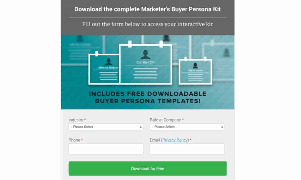
The company offered a guide to inbound marketing for free at the end of some posts. To access the book, readers had to fill in a contact form. HubSpot tested whether to provide a link to the form or to embed the form in the posts themselves.
When a form gets imbedded in that way, it’s called an ‘in-line CTA.’ HubSpot’s test found that their in-line CTA option improved the conversion rate by 71%. That’s a significant boost to lead generation that any firm is sure to appreciate.
Highrise Heading & Subheading Test
Highrise is a SaaS business specialising in customer relationship management (CRM) software. They performed an AB test to find the best possible combo of headings and subheadings for a sign-up page.

The firm developed five different headings and subheadings. They then randomised the combinations of those options and tested which performed best.
Switching up combinations like that goes against conventional AB testing wisdom. It’s often better to change only one variable at a time. In this case, that would have meant changing only the heading or the subheading. You can’t argue with Highrise’s results, though.
Through the test, Highrise’s original copy turned out to be their worst option. By trying new combos, the firm found a new heading and subheading pair that delivered 30% more clicks.
Groove Landing Page Test
Landing pages are critical to the success of any SaaS business. As a provider of customer support solutions for such firms, Groove understands that. That’s perhaps why they performed an extensive AB test of their own landing page design.
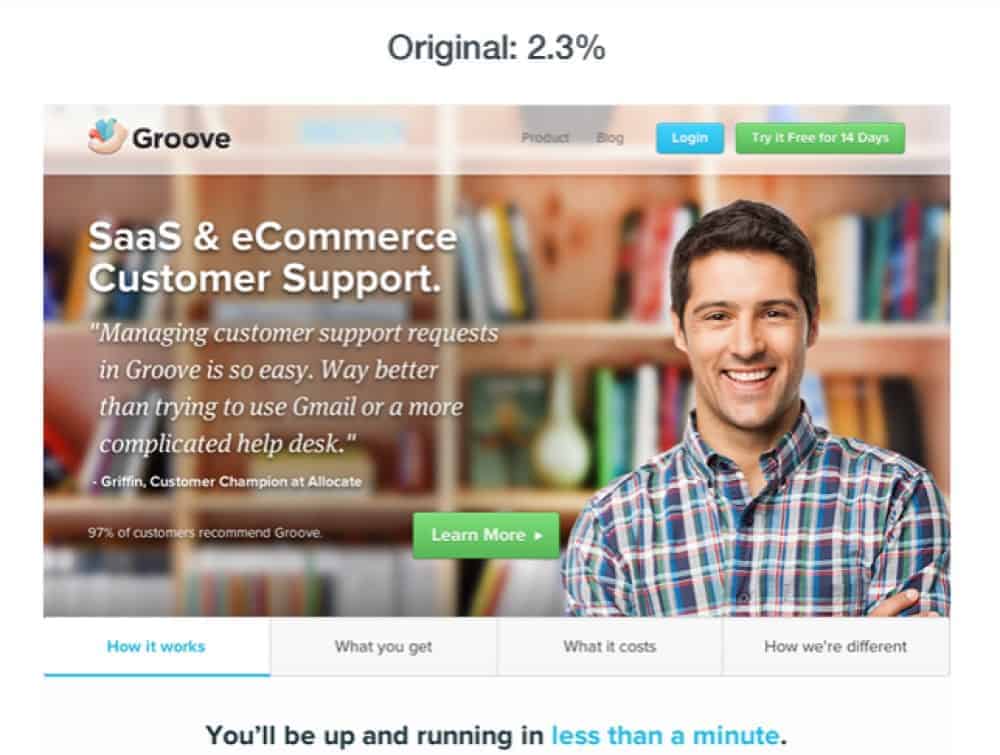
The company had a great product and blog, but a terrible conversion rate. They spoke to colleagues and experts and decided that they needed to redesign their landing page. To find out how they looked to their customers. The company talked to engaged users of their products. They found out what they cared about and how they spoke about the firm’s product.
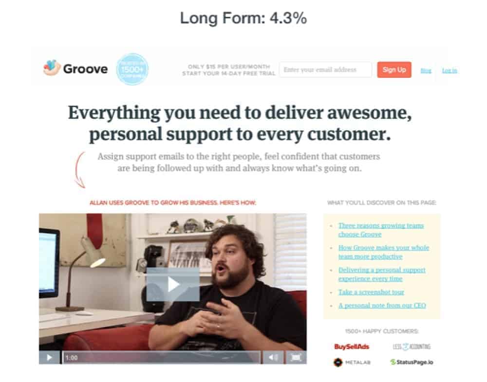
Using that feedback, Groove reshaped their page. They tested many different options, all using suggestions and wording from their customers. The final result was a new page that converted at 4.3%, rather than Groove’s previous lowly rate of 2.3%.
WallMonkeys Homepage Test
This is the first of our AB testing examples to feature a company that doesn’t use the SaaS business model. WallMonkeys sell decorative wall decals online. Their homepage test, though, still offers some useful insights.

The company’s original homepage had a large stock image and an overlaid headline. Their first test replaced the image. They swapped in a unique version, showing one of their actual products. The results were great. The website saw a 27% upturn in conversions. WallMonkeys, however, didn’t stop there.

The firm followed up with a second AB test. They replaced the homepage headline with a prominent search bar. The results this time were significant, with the conversion rate rocketing by 550%. Those kinds of results display just how beneficial AB testing can be. It also demonstrates the wisdom of performing multiple tests, not only one.
Server Density Pricing Model Test
Web design isn’t all about aesthetics. It can sometimes have a profound impact on how potential customers see your products. Take Server Density, for example. They provide hosting and website monitoring on a SaaS model. Their site, therefore, has always displayed their pricing models.
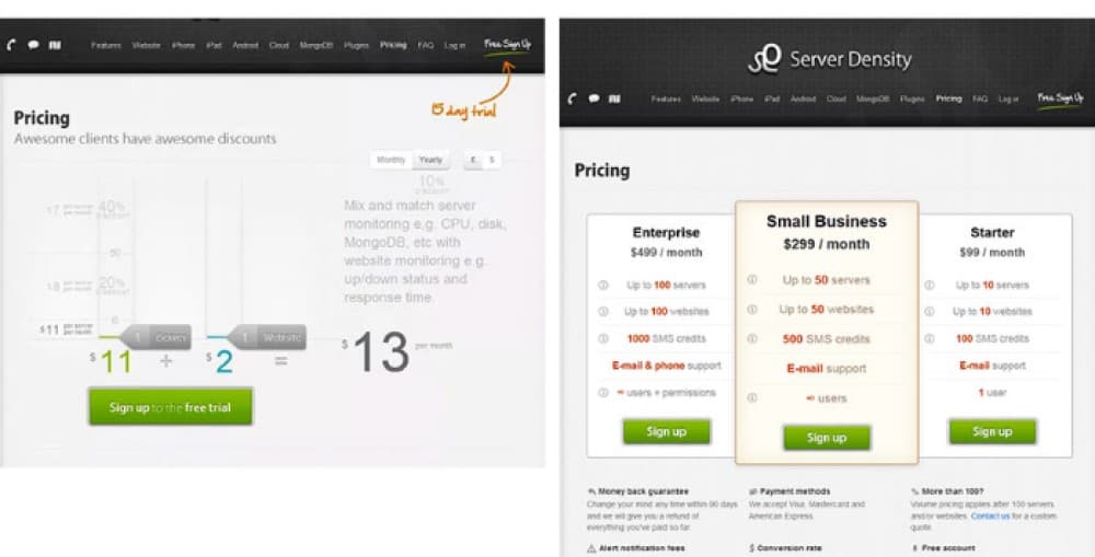
By performing an AB test, Server Density found that how they displayed their pricing models impacted conversions. The firm’s original page focused on service cost. As an alternative, they tested a comparative table.
The alternative version of the page delivered not one, but two notable advantages. It led to an increase in overall revenue for the business. It also decreased the number of free trial sign-ups that didn’t go on to subscribe.
Yuppiechef Navigation Test
This entry on our list of AB testing examples shows how simple tests can be. By only changing one small element of any page or asset, you can make considerable improvements to your site. Just like Yuppiechef did by testing the navigation feature on a landing page.
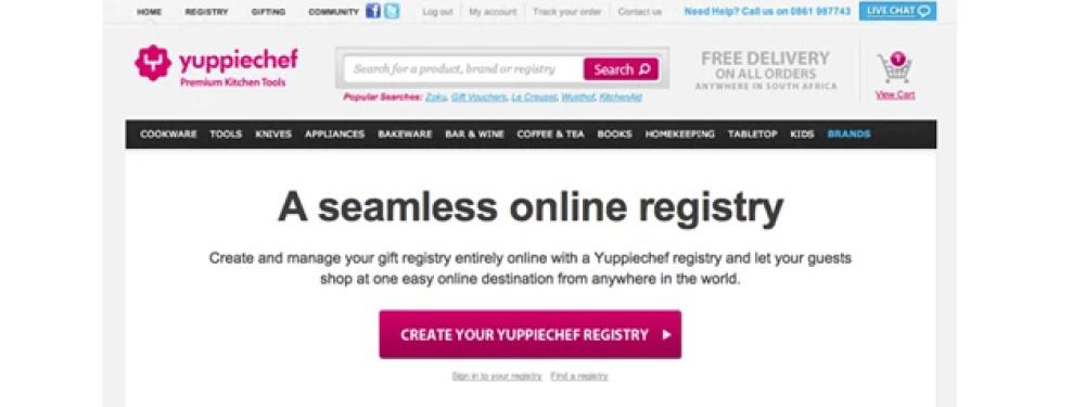
The kitchenware firm’s original page included a simple navigation bar toward the top. That bar had links to different types of products and areas of the site. Yuppiechef tested the impact of removing the navigation bar.
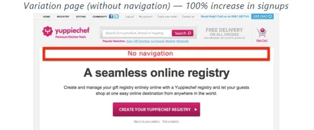
Without the bar at the top of the page, the company’s conversion rate jumped by 100%. Site users weren’t getting distracted by links. This change made a massive difference to Yuppiechef’s bottom line.
Humana Banner Test
Humana is a healthcare insurance carrier in the USA. Their AB testing example, like that of WallMonkeys, shows the wisdom of doing more than one test. In the case of the insurers, they were testing a banner advert.

The business wanted to boost the click-through rate (CTR) of the banner. Humana’s original banner had a headline, sales copy, a CTA, and an image. Via multiple, consecutive AB tests, the firm changed all those elements.

By testing each element, Humana ended up with a very different banner. The headline and copy were shorter and punchier. The CTA style got freshened up, and they made the image friendlier. By changing the copy and image, the banner’s CTR jumped 433%. Adding the changes to the CTA resulted in another bump of 192%.
Sim City 5 Sales Page Test
The world’s biggest brands use AB testing. Electronic Arts (EA) are a household name in the gaming industry. They split test the pre-order page of one of their most popular games, Sim City 5.

Via AB testing, the company found that marketing assumptions don’t always hold. They tested another page, which was identical but for the absence of the promotion. That simpler alternative performed 40% better than the original.
Those people who wanted to pre-order the game weren’t interested in any future purchases. The $20 off promotion didn’t appeal to them. AB testing, then, can help you avoid incorrect assumptions about your target audience.
RummyCircle Facebook Ad Test
Social media is a tool that every business owner must embrace. It can help your SEO, inform keyword research, and offer a lucrative marketing channel. If you do run social media adverts, AB testing will help you optimise them.
RummyCircle, a major Indian gambling firm, performed a simple AB test on one of their Facebook ads. They tested whether a hypothesis they had for the ad when viewed on desktop held for mobile devices.

On desktop, the firm found that users were more likely to click through the ad if they also commented on it. As such, the original ad copy included an invitation to comment.
The business’s test involved one ad version that kept the invitation and one that didn’t. On mobile, RummyCircle found that the option which didn’t ask for a comment performed better. AB tests, then, are also great for understanding different audience segments.
Olympic Store Checkout Test
The last of our AB testing examples shows that tests can also lead to significant changes. In the lead-up to the Vancouver 2010 Winter Olympics, the official merchandiser tested two types of ecommerce checkout.
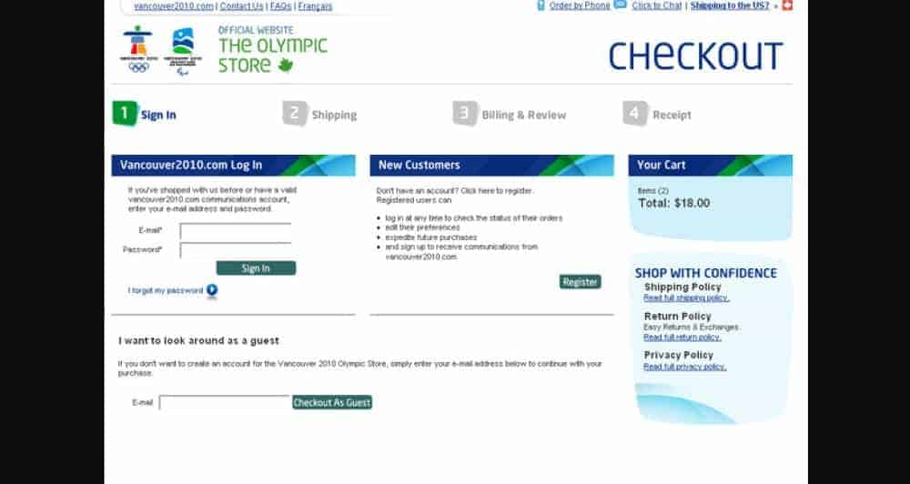
The first checkout option had multiple pages. Customers had to work through each page in turn to complete checkout. It made the process seem complicated.
The store’s alternative checkout put everything on one page. Customers could enter all the required info in one place. The new checkout also made it more evident that creating an account wasn’t a pre-requisite of buying something.
After only 606 transactions, the site’s owners felt they could end the test. The alternative checkout had outperformed the original by 21.8%. They scrapped that original and went with the new version.
Test Your Way to Success
Not all of the AB testing examples mentioned above will apply to your business. By learning about them, though, you should have a better understanding of the value of AB tests. They’re crucial to learning what works with your actual customers or target audience.
By performing AB tests, you can optimise your content and marketing assets for conversions. You’ll be sure that you’re presenting pages and putting out adverts that convert. That’s vital for generating those sales that will make for a healthy bottom line.


